Beyond the Rainbow: Revealing the Secret Brilliance of the Google Logo
The Google logo is a ubiquitous symbol, instantly recognisable across the globe. Its deceptively simple design—a playful cascade of coloured letters—has become synonymous with access to information and the vast potential of the internet. However, this seemingly straightforward logo holds a deeper meaning, one that reflects Google's core values and its commitment to innovation.
BRANDING AND DESIGN
4/12/20242 min read
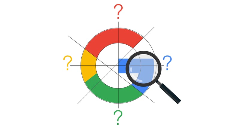
A Symphony of Purposeful Colours
A Silent Invitation: Unlocking the Power of Information
The Playful "L": A Nudge Towards Accessibility
A closer look reveals the lowercase "l" with its playful tilt. This subtle detail embodies Google's core principle of making technology accessible and user-friendly. It's a visual nudge, a reminder that the digital world shouldn't be an intimidating space but rather an inviting playground for exploration and discovery.
While the logo's colour palette evokes a playful rainbow, the order is not a strict adherence to the traditional spectrum. This deliberate deviation reflects Google's willingness to challenge convention and explore uncharted territories in the realm of technology. The vibrant green "L" stands out, injecting a sense of growth and constant evolution—a testament to Google's relentless pursuit of cutting-edge solutions.
A Logo's Evolution: Reflecting Growth and Maturit
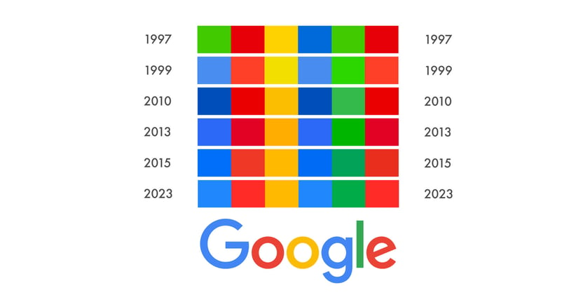
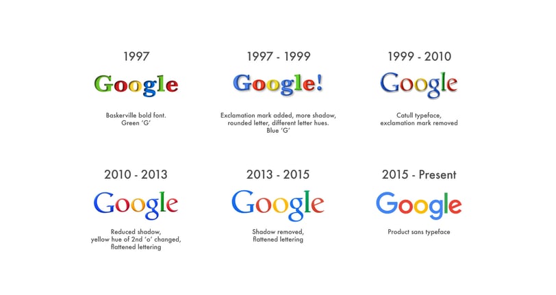
The Google logo we know today hasn't always been this clean and streamlined. Just like the company itself, it has undergone a metamorphosis over time. However, the core essence—a spirit of innovation, a thirst for knowledge, and a commitment to pushing boundaries—has remained constant. The early iterations, with their more whimsical serifs, have evolved into the sleek sans-serif typeface we see today, reflecting Google's own maturation as a tech leader.
The beauty of the Google logo lies in its ability to convey a multitude of messages through a minimalist design. It's a visual invitation, a gateway to the vast universe of information at our fingertips. It silently beckons users to explore, to delve deeper, and to embark on a continuous learning journey. There's always something new to discover—a hidden corner of the web waiting to be unearthed.
In conclusion, the Google logo goes beyond mere aesthetics. It's a testament to the company's core values: innovation, accessibility, and a dedication to unlocking the power of information. The next time you see the Google logo, remember—it's a subtle reminder that the quest for knowledge is a never-ending journey, and Google stands as a reliable guide along the way.
Stay Connected
Explore
Testimonials
Services
Get in Touch
Careers
Legal
© 2024 innura.com. All rights reserved.


